Star Control 2 Fonts
Out of all the things Star Control 2 is known for, the use of unique fonts to represent each race to reflect their attitude is something that is not mentioned as much as the game’s rich dialog and space combat gameplay.
The only other game that I know of that uses a unique font to represent a character is The Darkness, by Starbreeze Studios. It uses a twisted subtitle font to represent the demon that communicates to the player throughout the game.
Out of curiosity, I e-mailed a few major movie producers regarding the possibility of any movies using different subtitle fonts similar to the way SC2 does. I received a reply from Fox and Universal that they are not aware of any movies that uses different fonts in its subtitles to represent different characters. After, it may be distracting to people who are following along with the movie.
Then again, SC2 never had any speech when it first came out for PC. The fonts really did a nice job at making it clear that these humans are not the humanoid type characters that we see in Star Trek. Imagining the sound of their voices became much easier. When the 3DO version was released, the fonts were removed because there was actual speech. Since TFB released the source code for the 3DO version, The Ur-Quan Masters re-release was born, which combined the voices in addition to the fonts.
I even watched a few public domain silent films. In general, the only time different fonts are used is when the story is being explained to the viewer such as the introduction or to indicate whenever a character is speaking. The font does not necessarily represent the character in this case.
I e-mailed Paul Reiche about his experience during the font process of Star Control 2. Here is what he had to say:
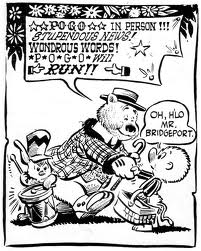
I’ve always been entranced by different letter shapes. As with almost everything good, bad or freaky, my font fetish stems from strange childhood experiences. My first memory of actually noticing the use of lettering styles was in ‘Pogo Possum’, a long-running, nationally syndicated comic about a possum, alligator and their other swamp friends. Their conversations ranged from the innocent to anti-war politics to dark and/or incomprehensible (see examples below.)
\
Next comes my Larry Niven paperbacks (purchased in my pre-teen years…) which featured the very compelling OCR styling.

Then, when my high school buddies and I started publishing our own RPG books, we spent a LONG time poring through the Letraset catalog to pick out the font for the cover of The Necromican, a book of new magic spells. Gothic rules!… but is somewhat unreadable, so we changed to the somewhat more readable ‘Printers Gothic’ after the first print run…
So, when Fred and I started realizing how important text was going to be in Star Control, we decided to create our own font system, complete with a special editor. Making those fonts were some of the happiest, most obsessive-compulsive days in my life. Not only did we have multiple, proportionally-spaced fonts, but I think we were the first game to have kerning – minute pixel adjustments to letter spacing based on specific letter combinations. For example, when combining L and T, the upper left corner of the T can fit into the blank space in the upper right of the L. I bet almost no one actually realized we were doing this, but to me it made all the difference in the world.I gotta go, but thanks for letting be babble about one of my favorite subjects!
‐ Paul


With the HD art inspired by UQM, I came across a thread on SCDB about finding fonts that stand out and represent each race just like it did in the original game. Choosing the right font can be complicated and there are so many to choose from, not all of them necessarily being “free”. Did you know that when the PlayStation 3 was first released, the logo on the top used the Spider-Man 3 font? When fonts are used in a specific manor, it really stands out. For example, I’ve seen the movies The Life Aquatic, The Royal Tenenbaums and Fantastic Mr. Fox. All three movies are directed by Wes Anderson and the fonts used throughout the film and posters are of a specific style.
Conclusion
The fonts are an awesome aesthetic in Star Control II. It is probably the first time any of us has seen specific fonts represent specific characters. The brief backstory that Paul described is very deep and they put a lot of effort in getting those fonts in there. I know that UQM HD has just begun and it’s great to see the great fonts being chosen for this version. The look of a font can convey the right emotion or personality when used properly. The reason why we don’t see fonts being used in this way today is because it lengthens development time and increases development costs because of licensing fees.
What do you think about the use of fonts to represent the character speaking?
Links
SCDB - Help! Star Control 2 Fonts, discussion about new fonts for UQM HD
