Mission Control Center Font
As I write this, Chris Hadfield has turned over command of the International Space Station and is on his way back to Earth.
Now what does this have to do with Star Control?
A very long time ago, when I was watching the news about Hadfield becoming the first Canadian to take command of the ISS. The news was very positive, describing him as the “the most interesting person OFF Earth”. Numerous images of him, the space station and the Misison Control Center. One particular image quickly caught my eye:
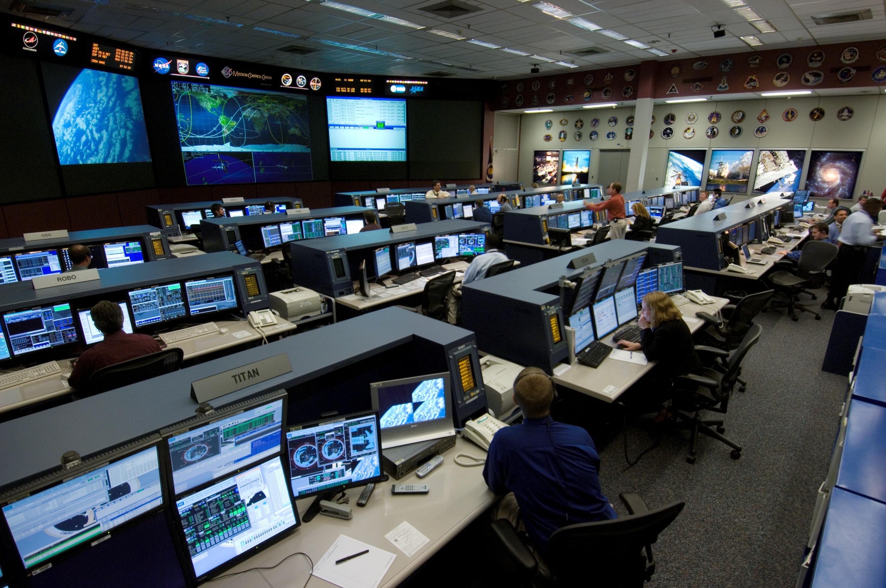
Flight Control Room of Houston’s Mission Control Center (2006)
Take a look at the top, just above the giant world map in the front of the room. Look at the font. Does it look familiar?
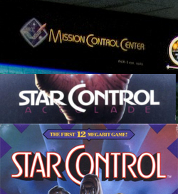
Mission Control Center font in comparison to the fonts for the Genesis and PC versions of Star Control
While the fonts are not exactly the same, I find it interesting they each use the “C” in “Control” to envelop the “o” and once again for “Center”. Of the few images I’ve seen, that Mission Control Center logo remains, though the layout of the room itself has changed significantly over the years for each mission. Unfortunately, I don’t know much about NASA’s policy on typography/graphics without doing more research or requiring internal knowledge. However, whoever designed the Star Control box art must have been aware of the font and it’s style.
Other than that, I think it’s interesting to see a similar style used between NASA and Star Control.
What do you think about this? If anyone has additional information, I’d love to hear about it.
Links
NASA Mission Control Center Website
Mission Control Center on Wikipedia
